In this project, I used levels of hierarchy and scale to make a logo design for Typography 1. I used my peers' first and last names and mixed them up for this. With this design, I created a logo that not only defined hierarchy but also made a logo that could be used on cards or t-shirts. I was pleased about this project because now that I know how to use Adobe Illustrator, I have made logos for my parents since they started their own separate business. My mom did a healthcare practice, and after being in the medical field for more than 20 years, she's finally a doctor—a nurse practitioner, to be specific. The best part about the logo is that I can use this first design to deal with the other stamps I happen to create.
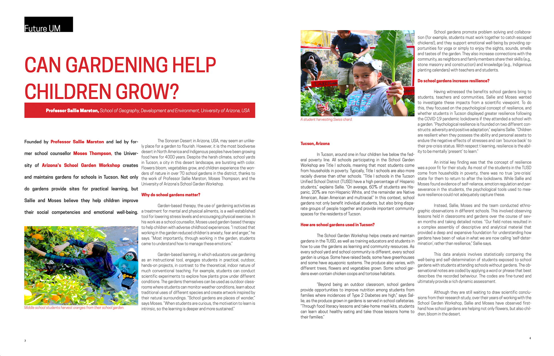
This magazine project made me rethink my whole life. I had to deal with many biased opinions regarding this work because some specific designs suited me better than others. I had to do a one-two-column and a 1-three column magazine; I also had to make sure the hierarchy of the title, heading, and words regarding the magazine was well put together. I struggled with the minor widows and justifications of the paragraphs and words. Another thing I worked on was learning and making sure the letter spacing for the title, subheading, and other words made sense.